What are the Tic, Line, Bar, Point and Figure Charts?
One of the best forex trader techniques for establishing positions in an online trading account involves analyzing exchange rate charts for a currency pair. Technical forex traders might use a variety of chart types for this purpose, which can include tic or tick charts, line charts, bar charts and point and figure charts.
The following sections will discuss each of the aforementioned chart types in greater detail. Although Japanese candlestick charts are also very popular among forex traders, a discussion of that especially detailed charting method lies outside the scope of this article.
The Tic Chart
The tic or tick chart is one of the best forex trader tools for very short term trading strategies such as scalping, or for timing an entry into the market being analyzed. This popular chart type lacks a time frame and simply involves graphing a new tick each time that the exchange rate changes.
Most forex traders operating in an online trading account via an online forex broker that supports a reasonably sophisticated forex trading platform like MetaTrader will also be able to plot both the bid and offer exchange rates on their tic charts, as Figure 1 below illustrates.

Figure 1: A tic chart for GBP/USD showing the offered exchange rate in blue and the bid rate in red.
The Line Chart
The line chart is another useful tool that helps traders smooth out the price action and identify trends. This chart type includes a time component and typically involves graphing the closing exchange rates for each time period depicted and connecting the resulting dots with straight lines.
Most forex traders operating in an online trading account via an online forex broker that supports a reasonably sophisticated forex trading platform like MetaTrader will be able to plot line charts similar to Figure 2 below.

Figure 2: A daily line chart for GBP/USD showing the closing exchange rate in black.
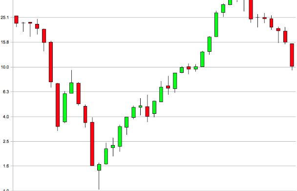
The Bar Chart
The bar chart is one of the best forex trader tools and provides much more information than the line chart. Like the line chart, the bar chart includes a time component, but it typically involves graphing a vertical line or bar between the high and the low exchange rates for each time period time depicted, as well as a left tick at the opening level and a right tick at the closing level.
Forex traders operating in an online trading account via an online forex broker that supports a reasonably sophisticated forex trading platform like MetaTrader will usually be able to plot bar charts similar to Figure 3 below.

Figure 3: A daily bar chart for the GBP/USD currency pair showing its high, low, opening and closing exchange rates in black.
The Point and Figure Chart
The Point and Figure chart is considered the best forex trader tool by many professional traders and it focuses only on price action. A Point and Figure chart lacks a time component, and it usually involves graphing a series of X’s or green boxes to show an upward move and a series of O’s or red boxes to show a downward move.
These unusual charts are typically parameterized by a box size expressed in pips and the number of boxes required to show a reversal from X’s to O’s or vice versa.
Although primarily used by professionals who often create them by hand on graph paper, retail forex traders operating in an online trading account via an online forex broker might need to obtain a special indicator for their trading platform in order to be able to plot Point and Figure charts similar to Figure 4 below.

Figure 4: A Point and Figure chart for the GBP/USD currency pair with X’s plotted in green and O’s plotted in red, and using a box size of 5 pips and a three box reversal. Resistance trend lines are plotted as green lines, while support trend lines are shown in red
For more exclusive Online Forex News, follow us on Twitter or join us on Facebook.


Comments (0 comment(s))