Stellar redesigns its logo, continues development
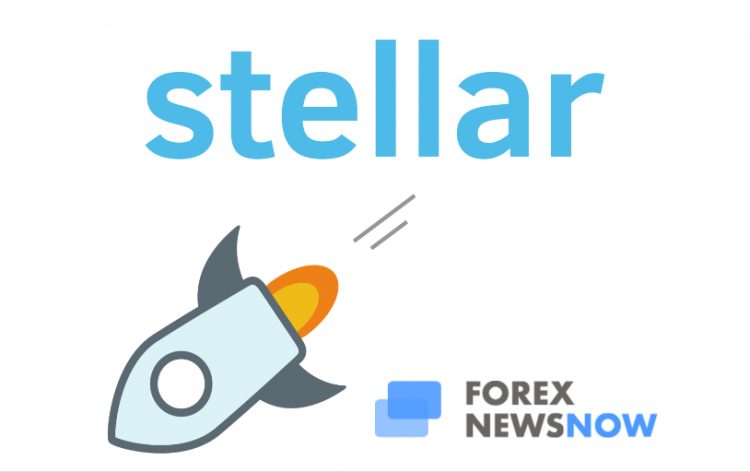
The folks over at Stellar have recently unveiled a new version of their famous logo. The industry-famous spaceship symbol will be left behind. Instead, Stellar offers us a new, more formal and business-friendly icon. Stellar has been making waves in the cryptocurrency industry for a while now. The company that originated in 2014 has seen some wonderful progress over the last years. After the company was acquired by Coinsquare, a number of projects are currently being built by the platform, including financially multifunctional banking mechanisms and completely decentralized exchanges. The moves the company was making, called for a more serious approach to their branding as well.
What were the criteria for the new icon?
Here are some of the components Stellar was aiming to accomplish when creating the new logo:
- The new logo should be versatile. The company claimed that the logo needed to be multifunctional. The Stellar platform aims to be an extremely diverse environment and the logo should reflect that. It should fit on a t-shirt, it should look good on a billboard, it should look good listed on a crypto exchange, it should look good as a thumbnail etc. Stellar emphasize the importance of these factors;
- The new logo should tell some of Stellar’s story. Stellar is diverging from the usual cartoonish imagery. They are not, however, abandoning the space exploration sentiment. The company believes that the new logo needs to represent the branding they went through. After all, Stellar integrated the space theme into its image quite thoroughly.
- The new logo should work as a currency symbol. Last, but not least, due to the fact that Stellar is a currency, albeit crypto, the new logo needed to visually represent a currency symbol. This is part of the versatility component, actually. In the future, whether the company wants to create a Unicode symbol of XLM or list it on exchanges, the icon must look natural and sleek.
Part of a bigger plan
Logo redesign isn’t all that stellar is busy with. A full redesign of the company’s site is in works and will go live in the upcoming weeks. In a way, the logo redesign is simply a teaser for what’s to come. Stellar has some pretty ambitious goals. They feel that their branding needs to support the level of seriousness that they’re approaching their responsibilities with. The new website and logo are supposed to be a breath of fresh air while we all collectively wait for the bull market to return.
What logo did the company come up with?
After all that deliberation, Stellar finally came up with the following logo:
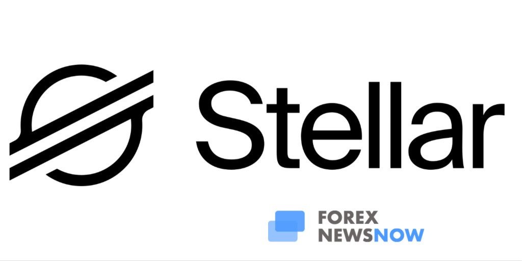
What’s In the Logo?
We’ll be honest, we did not expect the new logo to look this good. In fact, we feel that the new logo fits absolutely perfectly with the company. It’s obvious that the new design took a lot of deliberation. The cartoon rocket has indeed been dropped by the company, but space imagery is very much still there. The logo appears to be a Saturn-like planet with the supposed rings standing in for those lines that currency symbols usually have. The lines are positioned somewhat diagonally so the symbol would look a little more “currencey”. The sign looks a bit like a dollar sign but is distinct enough to be appreciated for its own merit.
The new logo definitely ticks all the boxes the Stellar team had put forward. It should be perfect for the company for branding and for a number of other purposes. And if the logo is any indication, we’re very excited to see what Stellar has in store for us with their redesigned website.
Other Crypto rebrandings
Stellar is by far not the first company to try and keep up with the increasingly professional world of cryptocurrencies. In fact, it marks an emerging trend. Crypto has come out of the internet’s woodwork and is establishing itself as a legitimate industry. It’s only logical that during these processes crypto companies are starting to pay more attention to appropriate branding.
Litecoin introduced a revamped website and a new logo last year. A number of other coins also got either names or logos changed. Zencash, for example, was rebranded as Horizen during 2018. Cryptocurrency companies are becoming more and more aware of the importance of effective branding and marketing efforts in running any kind of enterprise.
Branding is not what matters or should matter the most for a coin since this is not a vanity industry. Cryptocurrencies and blockchain have specific roles and functions to perform. However, that doesn’t mean that you shouldn’t try and garner better perception from the community. And with the ever-expanding scope of the market and the exchanges becoming oversaturated with coins and tokens, it’s more important than ever before to have the ability to stand out. Both visually and functionality-wise.


Comments (0 comment(s))